


Different ways to Mix Materials
Pairing materials is like composing music: the magic happens in contrast and rhythm. Hard with soft, warm with cool, matte with shine mix them right and a room feels layered, calm, and intentional. Below is a simple guide to combining materials so your space looks collected, not chaotic.
Start by reading your room’s “base notes”: the floor, the largest sofa, the dominant metal (if any). Those set the tone. Then add a few purposeful contrasts—one soft textile, one natural texture, and one touch of polish. Keep traffic flow open, and let surfaces earn their place (coffee tables for reach, rugs for warmth, lamps for glow).
Universal mixing rules
Aim for three to five distinct materials in a single view. Repeat each at least twice so nothing feels like a random guest. Balance temperature (warm woods vs. cool stone/metal), texture (nubby next to smooth), and finish (matte next to a hint of shine). Edit anything that doesn’t help function or feel.
Pairing 1: Warm Wood + Natural colors
Why it works: Wood brings warmth and visible grain (the pattern of the wood fibers); linen adds breathability and a relaxed, lived-in look.
Advantages: Cozy, timeless, easy to layer; ages gracefully with patina (the soft sheen and wear surfaces develop over time).
Disadvantages: Linen wrinkles; lighter woods can show dents.
Best for: Calm living rooms, airy bedrooms.
Pairing 2: Wood + Wool
Why it works: Wood is smooth and durable; wool is soft with springy texture. The mix reads elevated without feeling cold.
Advantages: Long-lasting, kid- and pet-friendly, excellent in cooler climates.
Disadvantages: Leather can scratch; wool can pill if quality is low.
Terms: Pilling = little fabric balls from friction.
Best for: High-use sofas, lounge chairs with wool throws or rugs.
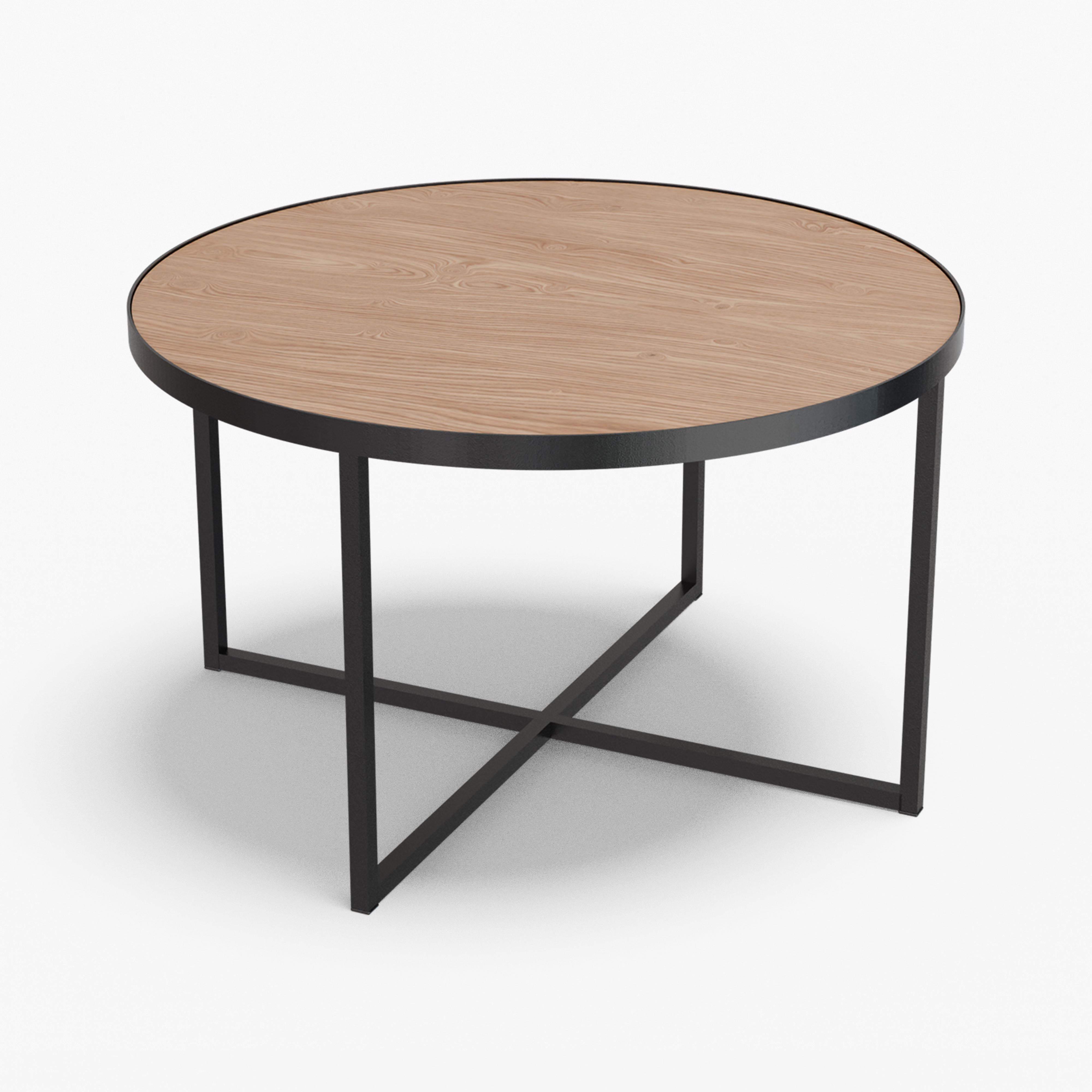
Pairing 3: Black Metal + Marble
Why it works: Cool metal frames the natural veining of stone sleek meets organic.
Advantages: Visually crisp; great for tables and shelving.
Disadvantages: Stone can stain; metal can oxidize (react with air/moisture, causing color change) if finishes are poor.
Best for: Coffee tables, side tables, consoles.
Pairing 4: Glass + Mid-Tone Wood
Why it works: Glass keeps sightlines open; wood warms and anchors.
Advantages: Makes small rooms feel larger; easy to clean.
Disadvantages: Shows fingerprints; edges need care around kids.
Best for: Compact living rooms, dining spaces that need visual lightness.
Pairing 5: Bouclé + Oak
Why it works: Bouclé (looped, nubby fabric) gives plush texture; oak’s steady grain grounds the softness.
Advantages: Cozy without feeling fussy; handles neutral palettes well.
Disadvantages: Bouclé can snag; choose tighter loops for durability.
Best for: Accent chairs, benches, ottomans.
Pairing 6: Wood + Cotton
Why it works: Airy woven texture with casual, sturdy fabric—natural and breathable.
Advantages: Light, summery feel; great for layering plants and ceramics.
Disadvantages: Rattan can dry out in strong sun; canvas can stain.
Best for: Sunrooms, relaxed dining nooks, balconies (covered).
Pairing 7: Concrete + Wood
Why it works: Industrial solidity meets rich, warm wood serious but welcoming.
Advantages: Highly durable; visually balanced.
Disadvantages: Concrete can chip; heavy to move.
Best for: Dining tables with wood chairs, entry benches with concrete planters.
Pairing 8: Ceramic + Raw/Light Wood
Why it works: Handmade glaze variation plays nicely against pale, simple timber.
Advantages: Adds craft and softness; easy to color-accents with vases.
Disadvantages: Chips if knocked; seal light wood to resist stains.
Best for: Shelving displays, bedside setups.
Pairing 9: Matte black + Brass
Why it works: Flat walls make metal details gleam just enough shine to lift the room.
Advantages: Perceived depth; great evening ambiance.
Disadvantages: Too much brass can skew flashy; keep to hardware/lamps.
Best for: Lamps, cabinet pulls, mirror frames.
How to build your mix
Start with your largest surface (flooring or biggest sofa) as the “base.” Add a contrasting anchor (stone, metal, or glass) for structure. Layer a tactile textile (wool/bouclé/linen) for softness. Repeat one material in a second spot—wood legs echo a wood table; brass lamp echoes a mirror frame—so the room reads cohesive. Finally, add one handmade note (ceramic, woven basket) for soul.
Common pitfalls and easy fixes
-
Everything smooth: Add a nubby textile or woven piece.
-
Everything warm: Introduce a cool counter (stone, glass, blackened metal).
-
Everything cool: Bring in warmth (wood, leather, warm-toned textiles).
-
Lone accent: Repeat that material once more so it feels intentional.
How to choose:
-
Purpose: Is this a lounge zone or a high-traffic hub? Pick durability accordingly.
-
People: Kids, pets, guests—do you need wipeable surfaces or forgiving textures?
-
Focal point: What do you want to notice first—grain, veining, or a soft textile?
-
Traffic: Will bags, toys, or chairs bump these edges? Round them or toughen materials.
-
Scale: Do solid surfaces (stone/wood) and soft ones (textiles) feel proportional?
Bottom line
Mix warm + cool, soft + hard, matte + a little shine. Repeat your key materials, let function lead, and your home will look better because it works better. If you want, I can tailor a material palette for your exact room and lifestyle.


